Here they are! The Pantone Color Institute announced the main colors of the autumn-winter season 2017-2018. Fashion designers, take note of 10 of the best shades of the New Year.
-
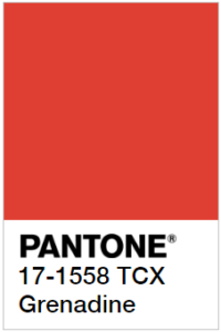 The Red Grenadine

Revolutionary red, probably, will never go out of fashion for long. Grenadine is characterized by energy, courage and conquering beauty. This is a top color shade of 10 colors that can ignite any interior. In order not to overdo it with energy, use the Grenadine for bright details such as a sofa, a shelf, and flowerpots.
-
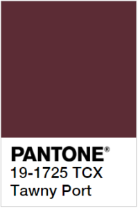 Port Wine

Very refined color on the border of Bordeaux and walnut, which repeats the shade of port in the barrel. It looks extremely deep in textiles of soft fabrics and strict wall decoration, ideal for creating contrasts. In combination with white makes the interior rich and refined.
-
 Ballet Shoes
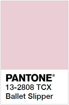
In the palette of this year, the pink color is strict and light. In the interior, it blends well with a strict white-gray scale, and with colors that are more succulent. Using pink as the color of the walls in the room, you can get a very warm and refined interior.
-
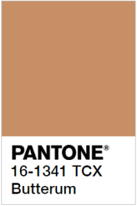 Oiled Rum
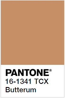
This shade gives warmth and comfort; it looks great in different applications. How to use Oil Rum in the interior? As the leading color of the walls in the company with a white color, bright or thick, dark shades, with furniture made of natural wood. The color of Oil Rum is recognized as a good base in any interior composition. Could be combined well with any color from top 10 by Pantone.
-
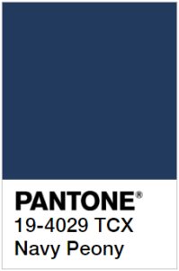 Sea Peony
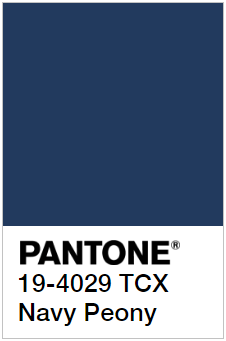
Infinite and enticing, deep blue is a model of elegance and style. It is favorably compatible with other colors, perfectly emphasizes light shades, can act as the color of one of the walls in combination with gray, milk. In the interior, furniture with a blue upholstery, complemented by small details of this color, looks profitable.
-
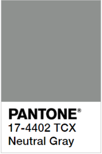 Neutral Gray
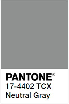
Gray color in this season is softer than in the past, but no less beautiful and noble. This will be an excellent basic shade for creating a fashionable interior. Successful as a base of Scandinavian style, loft or industrial minimalism. Neutral Grey combined well with all colors from top-10 by Panton 2018, such as the Oiled Rum.
-
 Shady Elegant
The dark and juicy green color is filled with energy, beauty and richness of nature. Use it in the interior and you can add home life and subtle beauty. Reflect it in carpets, tropical wallpaper patterns, velvet curtains – green is beautiful in any detail.
-
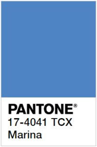 Marina

Blue as the sky above the sea, the color of the Marina Pantone is beautiful and attractive. It can be used successfully with white, blue, gray, spring green. Looks perfect in the Scandinavian style as the leading color. It is very unusual and cozy.
-
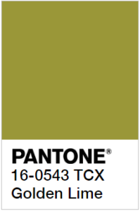 Golden Lime
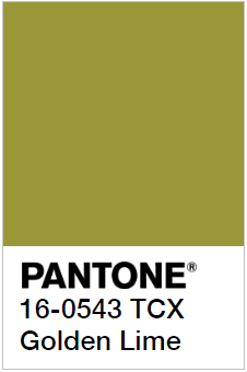
What is still in common with military themes is still popular today. A golden lime is a noble variation of khaki color. How to use Golden Lime? It is designed simply for soft and cabinet furniture, advantageously used in small decorative elements. It looks better in calm, close to the classic interior designs.
-
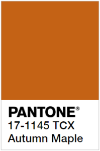 Autumn Maple
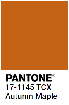
Hot orange is called the warmest color of Pantone this season. It fits perfectly with the color of the Marina, Neutral Gray, and muted green or brown. Ideal for autumn interiors, as the main color, will warm the rooms on the north side of the house; well emphasize the cool colors in decorative compositions.
Each of the Pantone colors of this season is self-sufficient; it looks good both as a leading color and as an additional color. We are sure that in these colors you can find yours. Boldly use it in the interior and be in the trend of this season.