Bright colors in the interior is a great way to make it more individual, add energy to the usual rhythm, and create an impressive atmosphere. That is why in 2018, interior design votes “FOR” bright decisions. Therefore, to implement color experiments successfully, read the tips of designers on how to combine colors and work correctly with bright ones.
Five rules for working with colors
 Always consider lighting in the room

After picking up the desired shade, inspect the trial copy under different lighting conditions – outdoors, indoors in the light of a yellow or white lamp, in the evening. If you like chosen color in any light, you can safely stop on it.
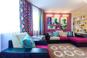
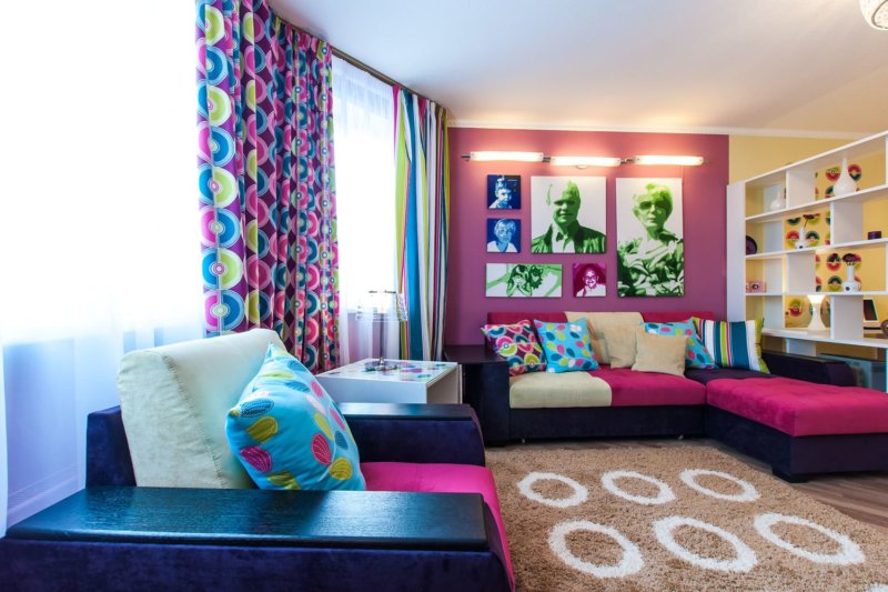
- Without diversity
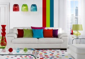

Do not use too many colors in one room. Especially if you decide to give preference to bright ones for the first time. Use it alone. If you paint each wall in different colors, it turns out disharmonious and not too comfortable for living. The abundance of color in the house creates emotional uncertainty, visually difficult to perceive.
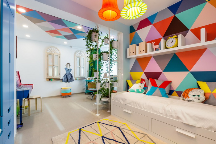
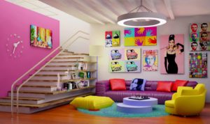 Color zones

It is enough to choose in the room or the whole house the place where you want to make a color accent. It can be a wall, a door or even a ceiling. By the way, bright ceilings look great even in small rooms.
For those who are afraid to paint walls in living rooms brightly, designers advise to practice on non-residential premises. Bright color is perfect for connecting rooms. For example, a corridor or hallway. Often mistresses choose juicy shades for kitchens. These zones perfectly enliven the overall interior. Bright colors on doors, slopes, in textile elements also look good. Interior design only wins from this.
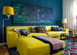
- Color mismatch

It happens that after painting the room the owner understands that the color is too bright and looks completely different than it would like. To avoid such an error, try to choose a lighter shade of chosen color you like. The fact is that in large areas, colors are perceived quite differently. They are more active, brighter, and more difficult to look. Consider this. If this has already happened and there is no possibility to repaint the wall, save the situation with white color. White furniture, carpet, portieres can help to calm the situation.
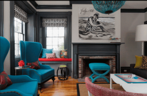
 Combine colors in the rooms
The colors you use in all rooms must harmonize and blend in with each other. Do not paint the bedroom in pink, and the living room in orange. Choose a palette, where colors look harmonious, emphasize each other. So the rooms are allocated, and the general concept of housing looks organically.
Bright colors in the interior – it is stylish, bold and not scary at all. However, if you are still afraid of color abundance, use a simple rule – in each bright room create areas of calm tone. It is enough to use light louvers on windows, furniture or even paintings in pastel colors. What is it for? Not accustomed to bright colors eye, will rest on light colors. In addition, with light details, the color looks juicier and more interesting. Successful experiments!